Typography
The following projects are type-focused print deliverables. They showcase my ability to use different design tactics to communicate the information for both print and digital pieces.
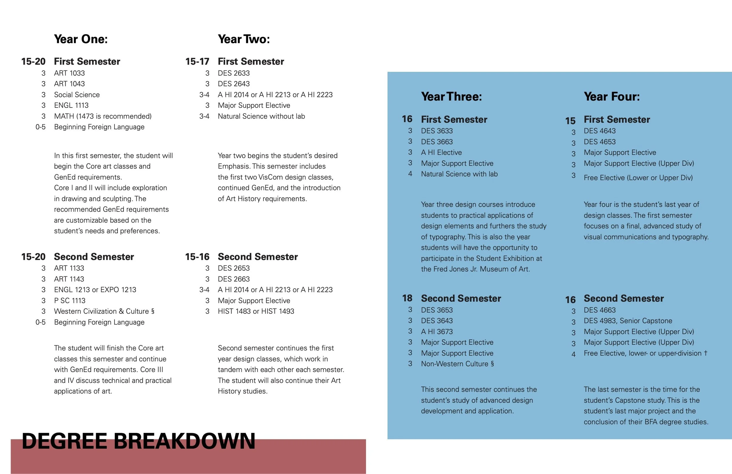
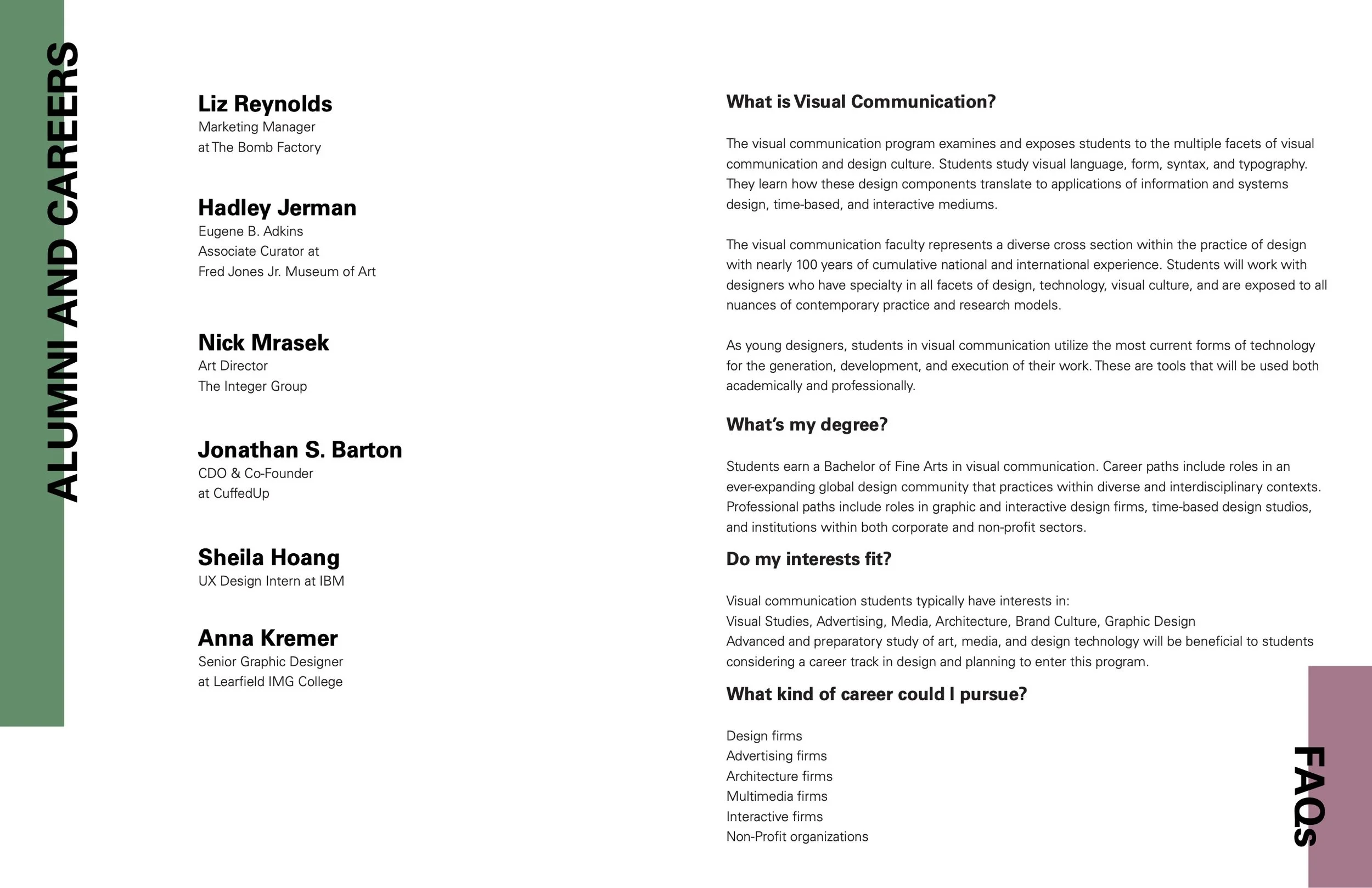
Design of Degree Program Info Booklet
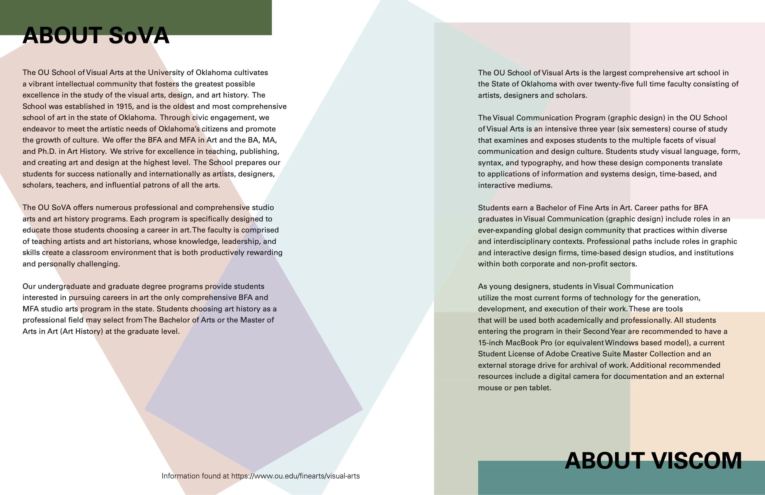
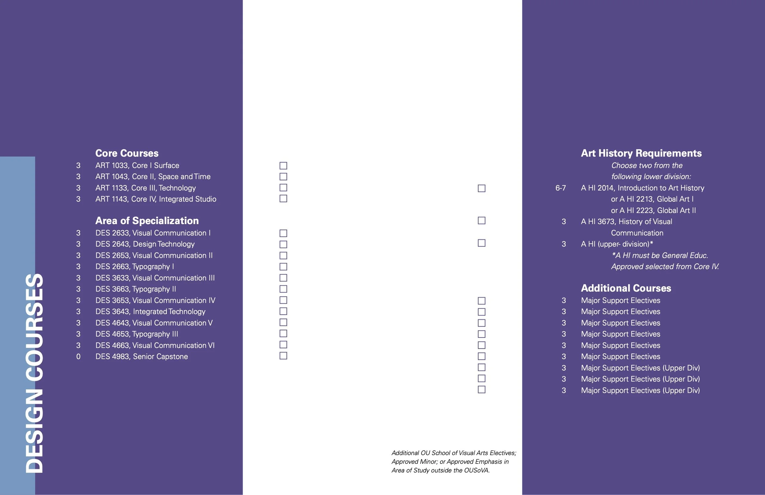
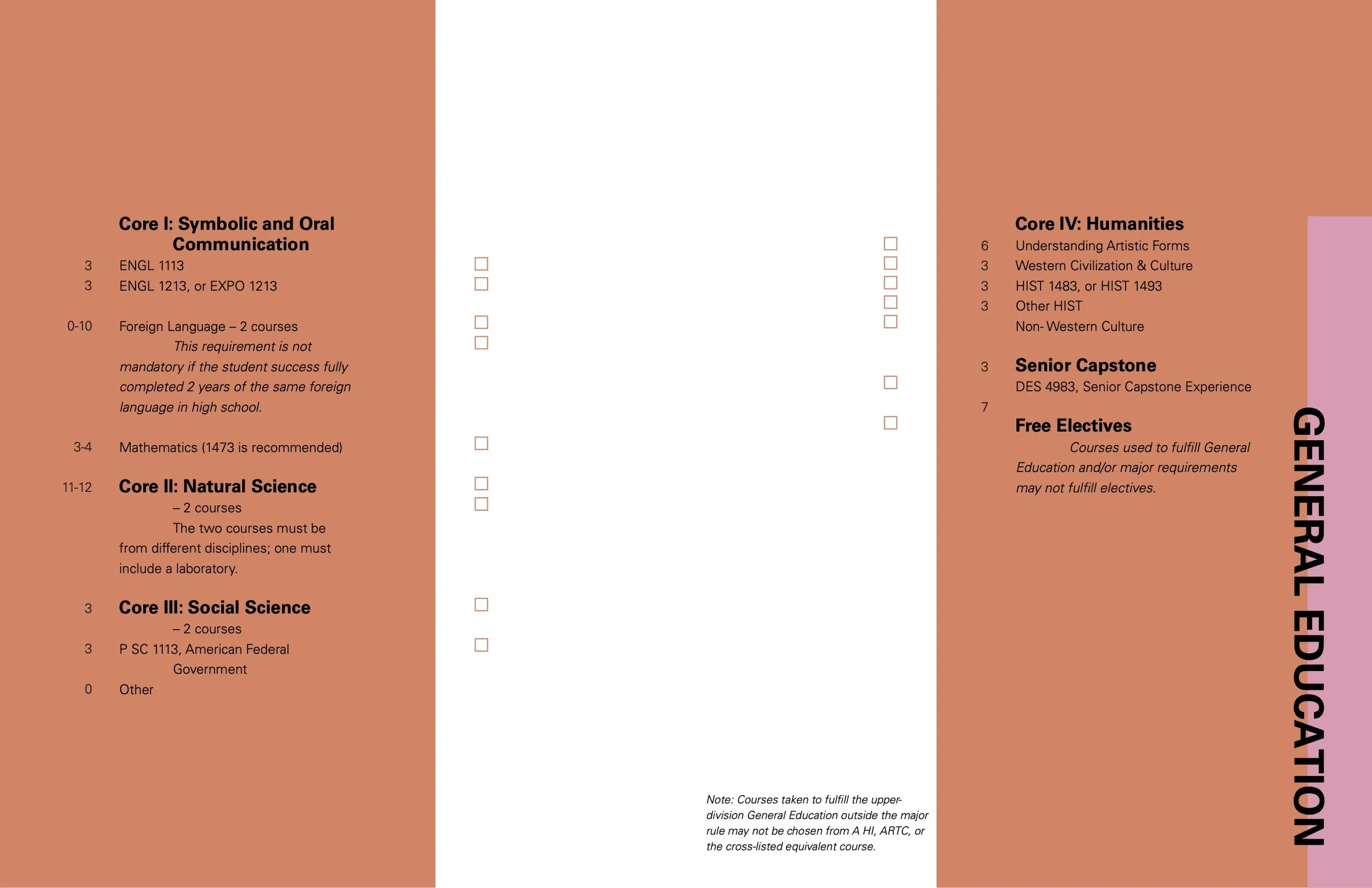
The University of Oklahoma provides students with “degree sheets” that breakdown the course requirements for all majors. These sheets are helpful for tracking progress and planning ahead; however, the original sheets are difficult to read. The challenge of this project was to recreate the degree sheets to portray all the necessary information in an interesting and usable way. From there, we created information booklets for prospective students based of the degree sheets and other relevant topics.
For my design, I focused on the use of color as an information divider and highlighter. Translating those colors and information blocks, I then created the booklet shown here. This booklet serves to provide information while energizing the program, evoking excitement in the prospective students. I also created a color-block, brand identity for the Visual Communication program.
Cowtown Marathon Promotional Posters
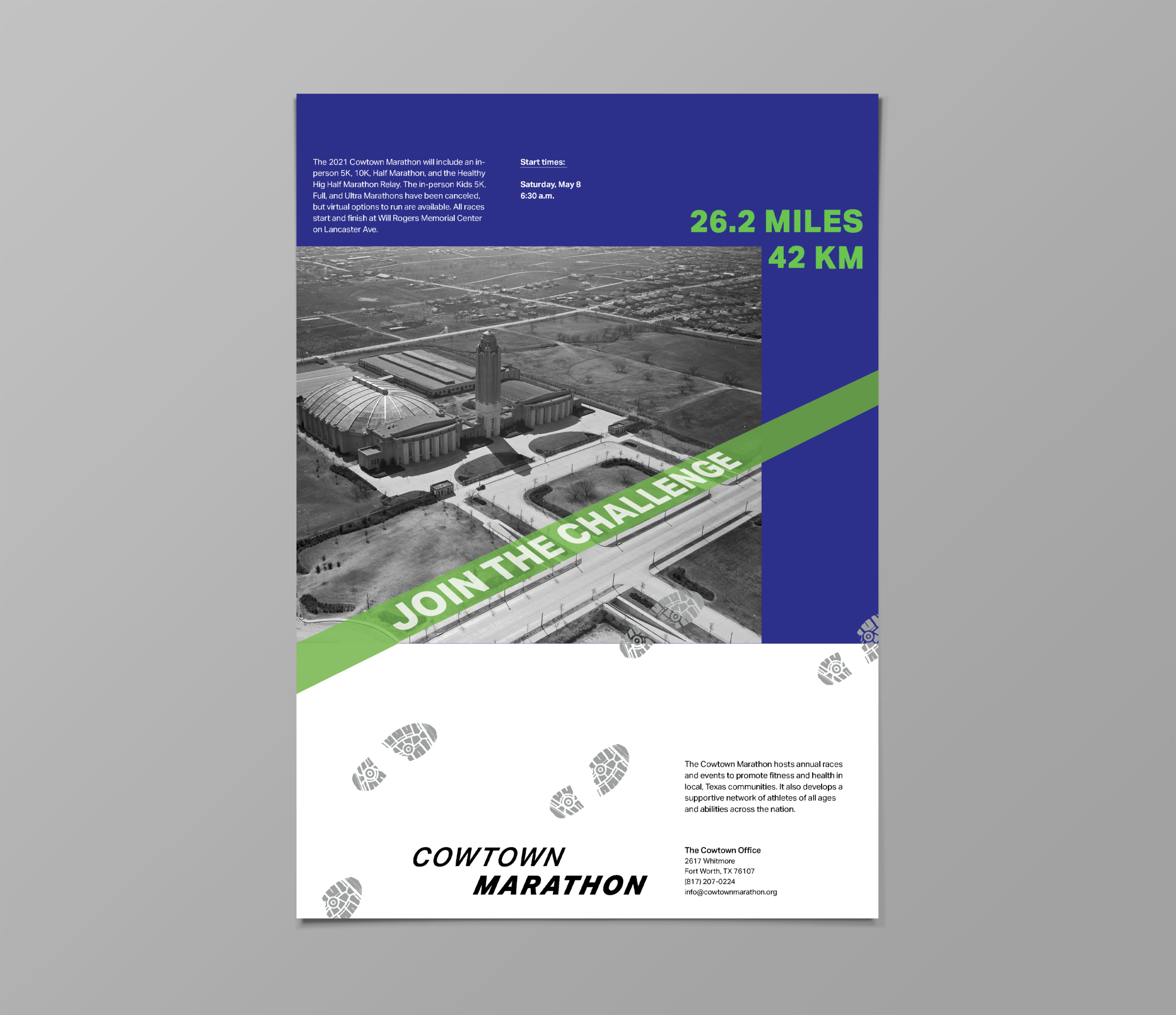
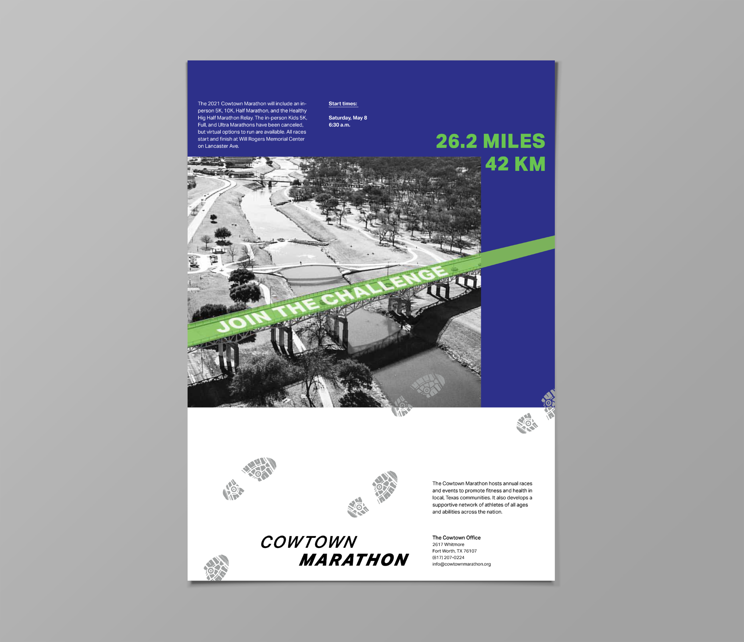
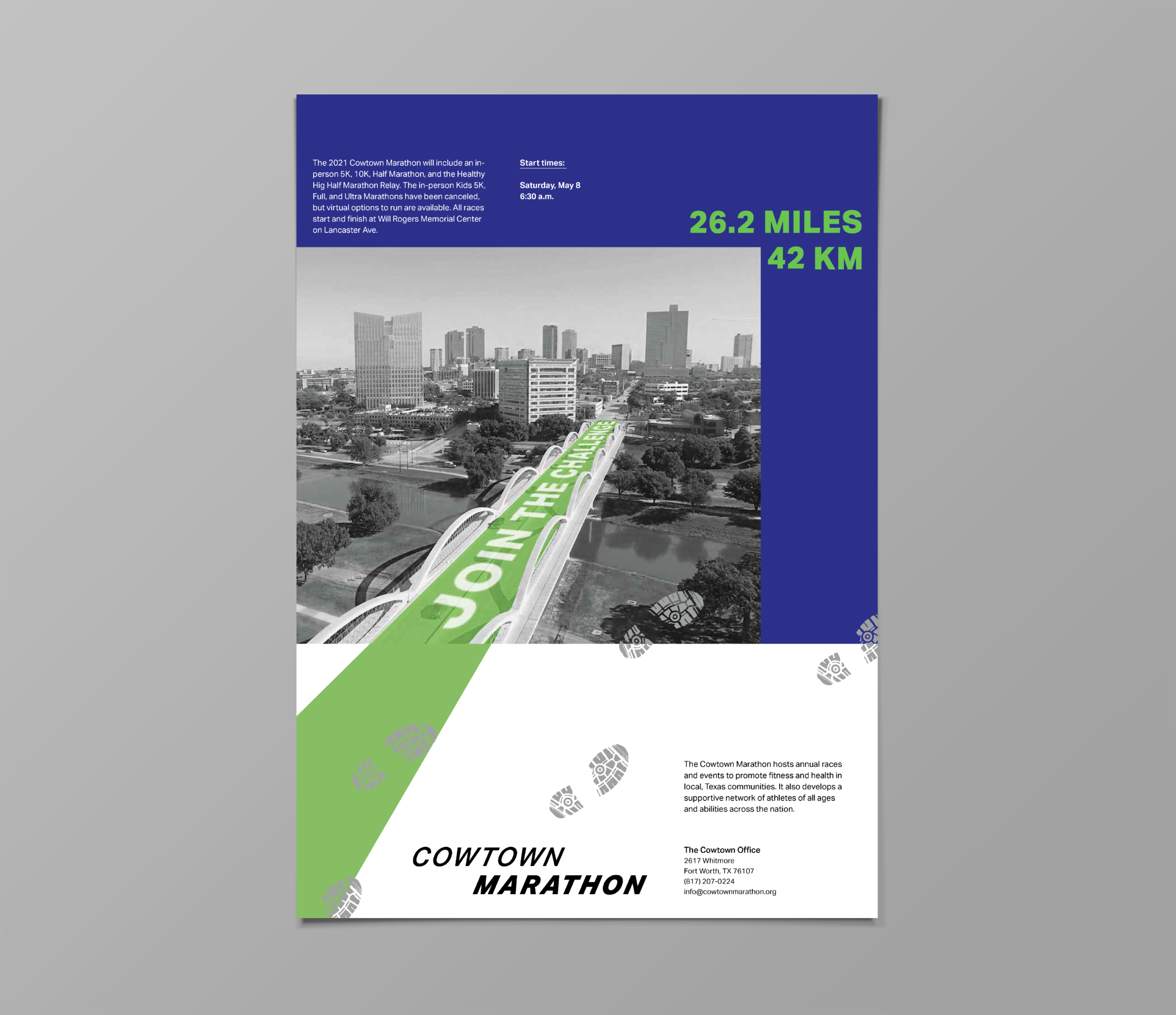
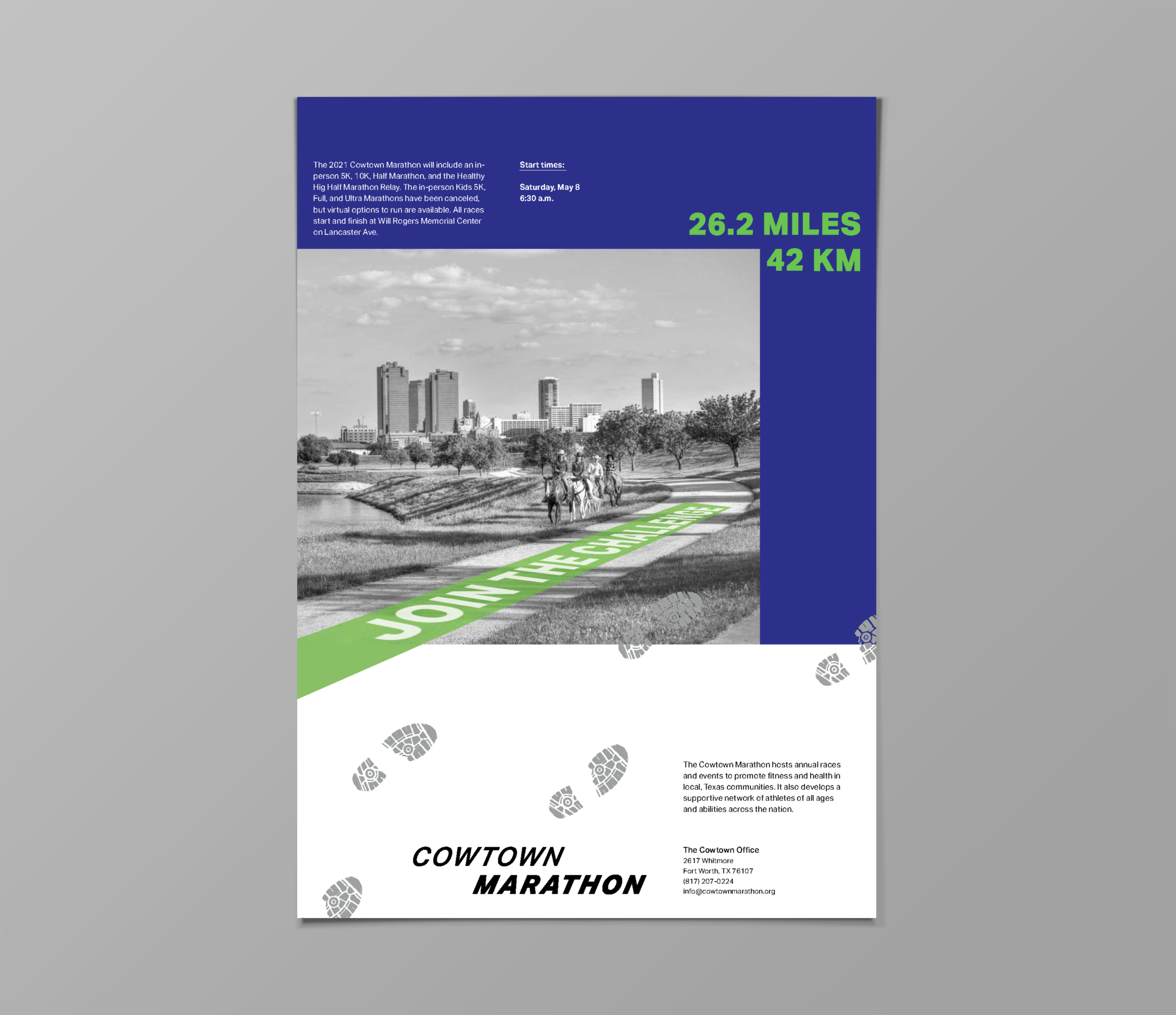
The Cowtown Marathon is the largest multi-event road race in North Texas, attracting thousands of participants each year. This poster project includes designs for a potential promotion campaign for the 2021 annual event. Using the brand’s colors and typography, the posters highlight some of the iconic landscapes of Fort Worth, Texas. They attract the eye, relay essential event information, and express a simple but effective call-to-action.
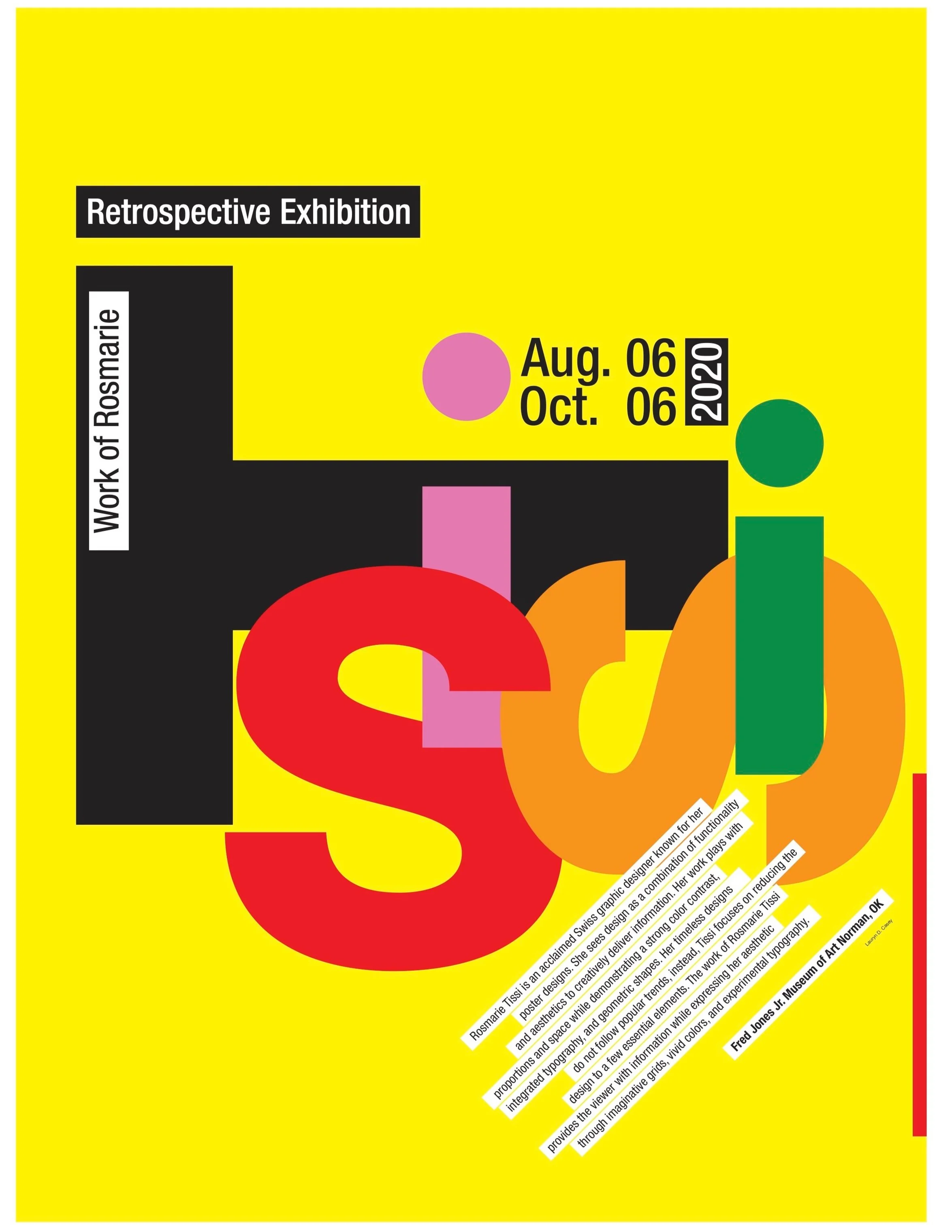
Rosemarie Tissi: Poster Design
Inspired by the incredibly talented Rosmarie Tissi, this poster is a concept piece for a museum exhibition. The exhibit would feature various famous graphic designers and artists. The poster concept is based off Tissue’s own work, reflecting her love of vivid color and loud type. The goal of the project is to highlight the artist’s contribution to graphic design as well as advertise the exhibition.
Art Museum Re-brand and Poster Design
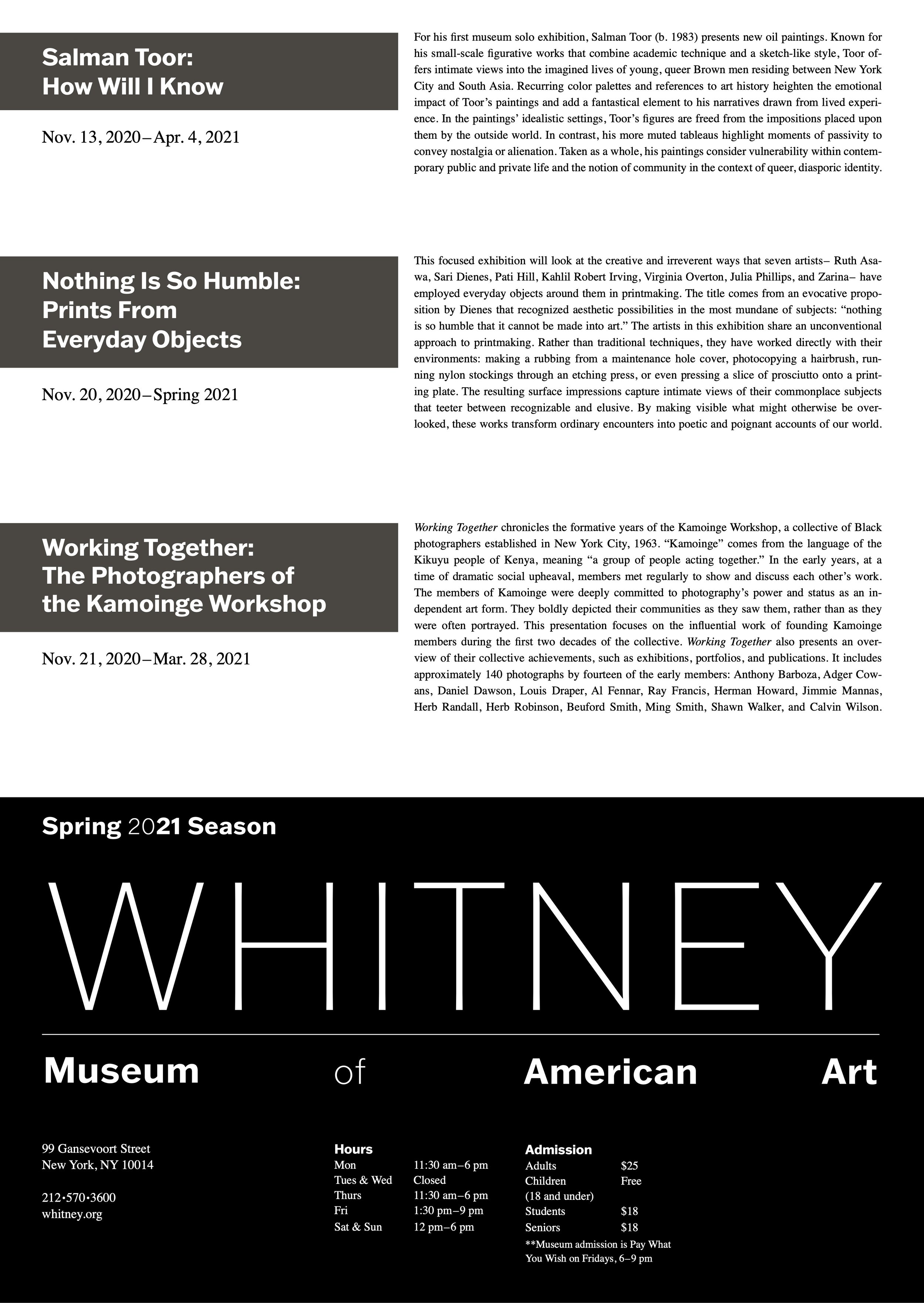
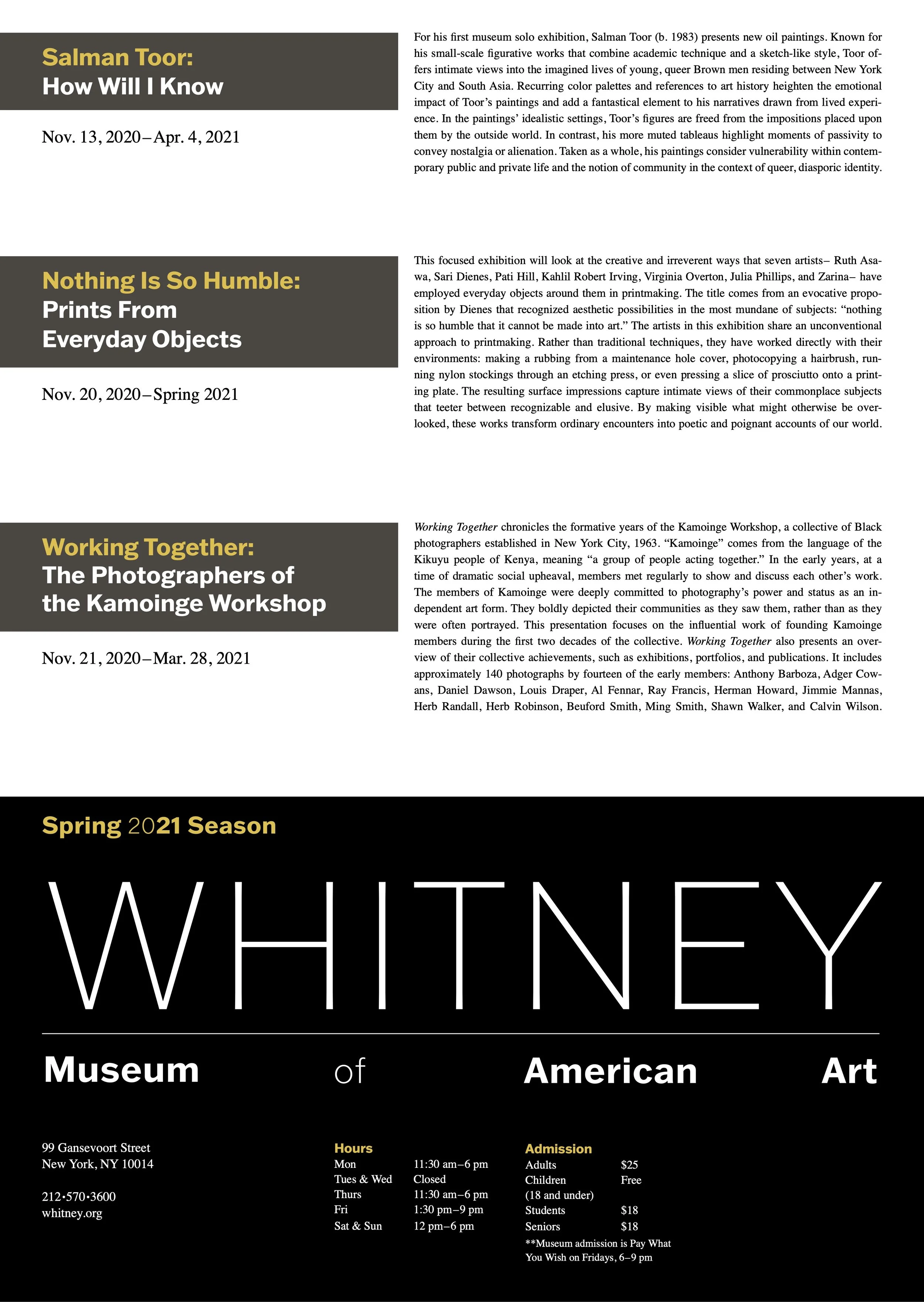
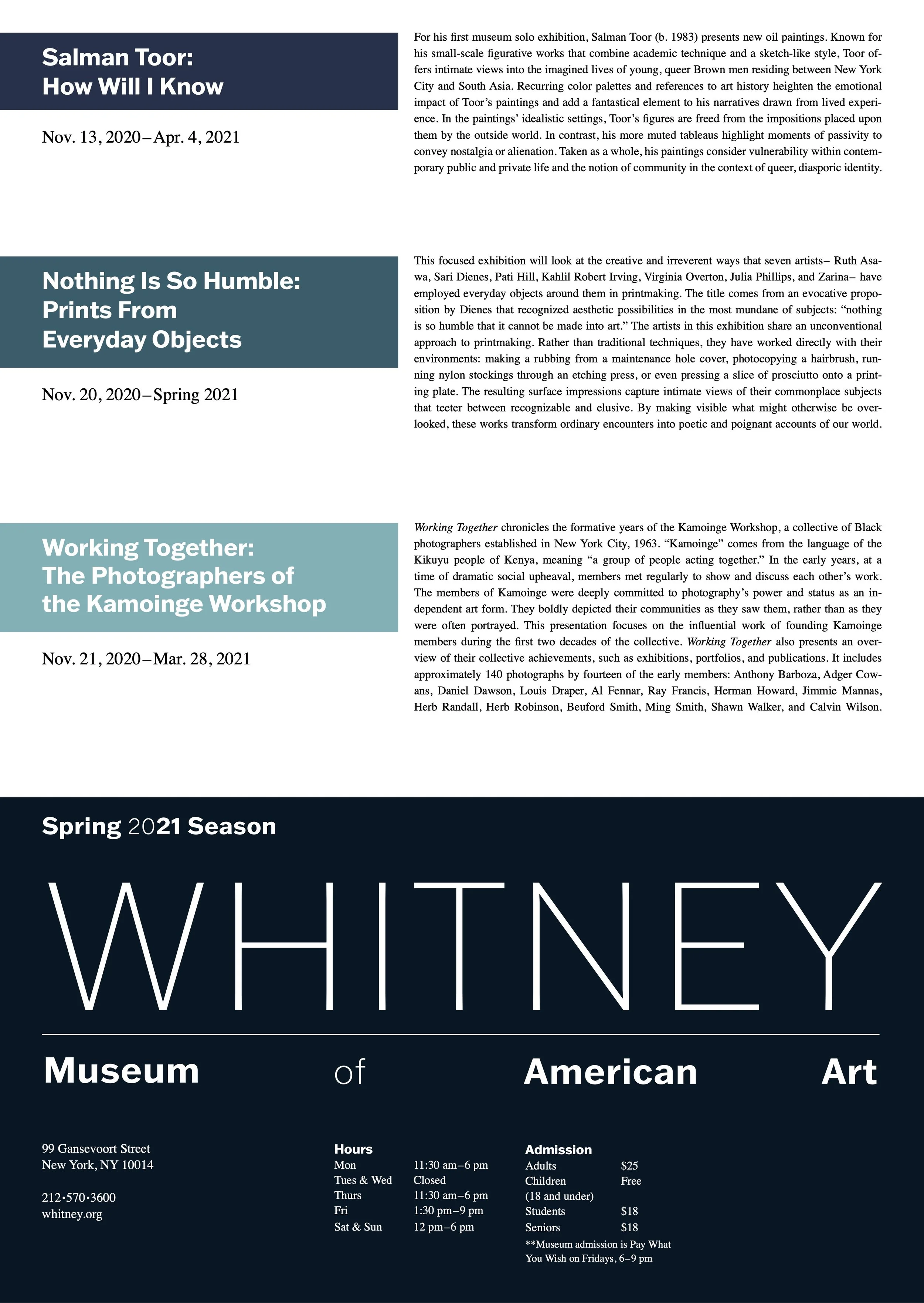
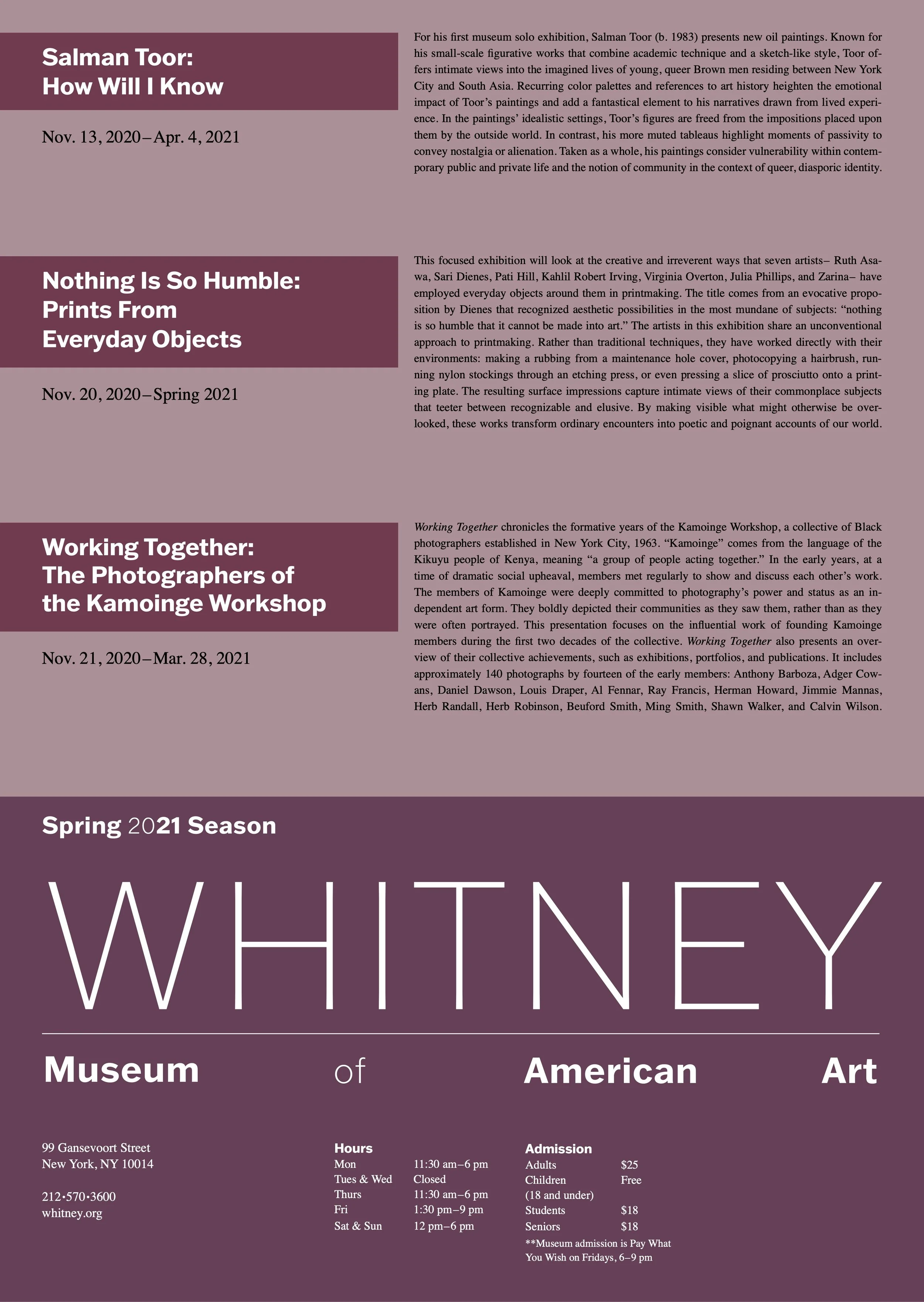
The project began with research on a chosen American art museum, finding information about the museum’s identity and the type of exhibits the museum hosts. I decided to research the Whitney Museum of American Art because of the strong identity and contemporary aesthetic of the muse- um. Since this project was focused on creating a new identity for the muse- um, I looked forward to the potential challenge this subject presented. The identity I created highlights the museum while remaining versatile and minimalistic.
Once I created the identity, the next step was developing a poster for three of the museum’s current or upcoming exhibits. The posters are meant to be informative as well as eye-catching. I decided on a simplistic layout, with each section of information divided clearly through graphic elements and typographical contrast.
